


Specs+Spaces®
Dunn-Edwards Portraits
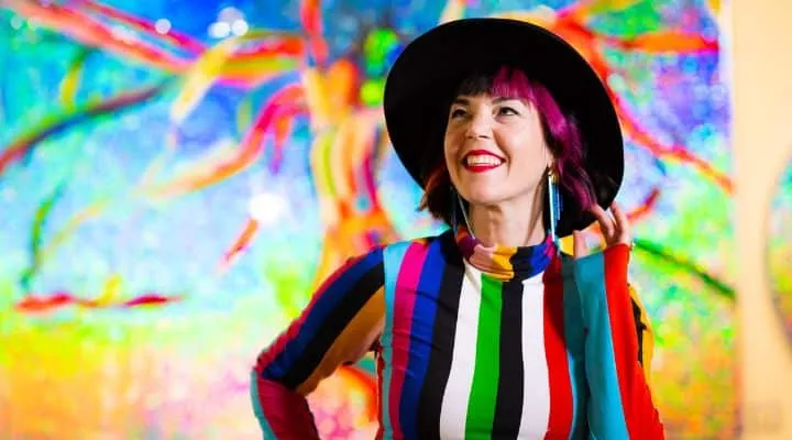
Dunn-Edwards Portraits: California Man Pursues Creative Path Over Planned Medical Career

Specs+Spaces®
Color
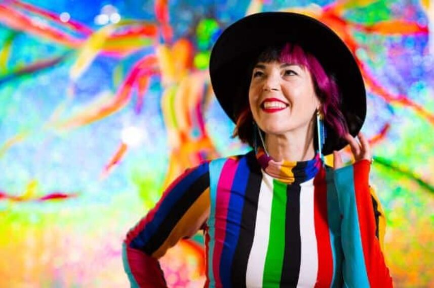
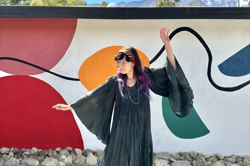
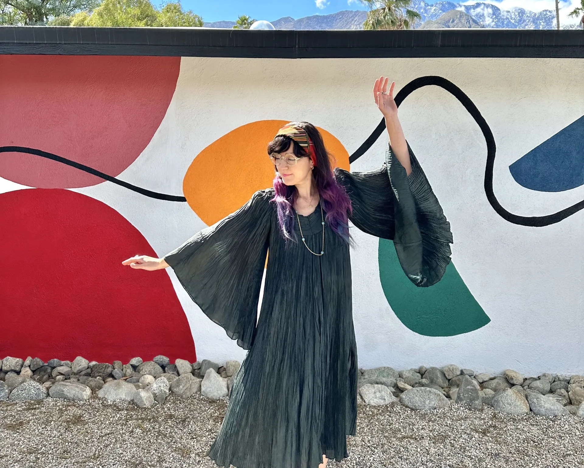
Behind the Scenes: Sarah Stieber Shares Colorful Insights on her Latest Collaboration with Dunn-Edwards
Specs+Spaces®
Color
Skipping Stones (DET567): Dunn-Edwards 2024 Color of the Year

Specs+Spaces®
Color
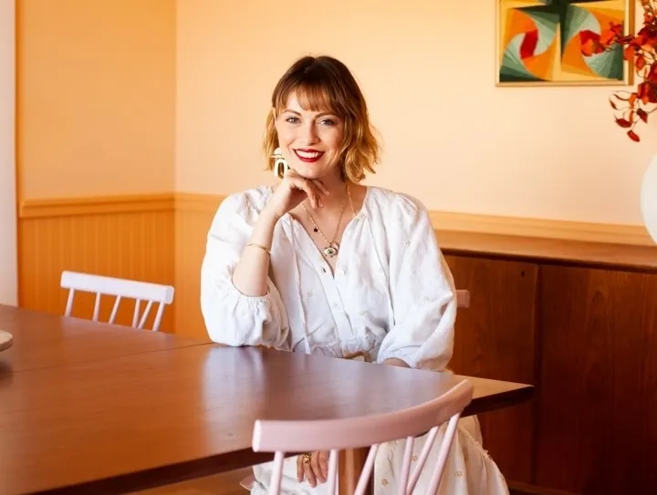
Colorful Conversations: Exploring the Creative World of Caroline Geys
Specs+Spaces®
Color
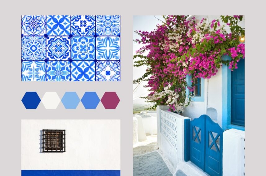
Best Blues for Leading Architectural Styles of the Southwest: Spanish Style Homes
Specs+Spaces®
Showing 1 - 7 of 764 results


Featured Bloggers

Christina Bantigue
Marketing Communications Manager

Madison Pfeifle
Marketing Communications Specialist

Danielle Kinahan
Marketing Segments Manager